Author: kyleleitch

  • Algorithmia White Paper

    Algorithmia White Paper

    Algorithmia’s marketing team had a collection of technical content they wanted to share, but they needed a way to make it visually engaging and easier to understand. The challenge was to compile the content into a series of technical white papers, designing graphics that clarified complex concepts while staying true to their established brand.

    Process

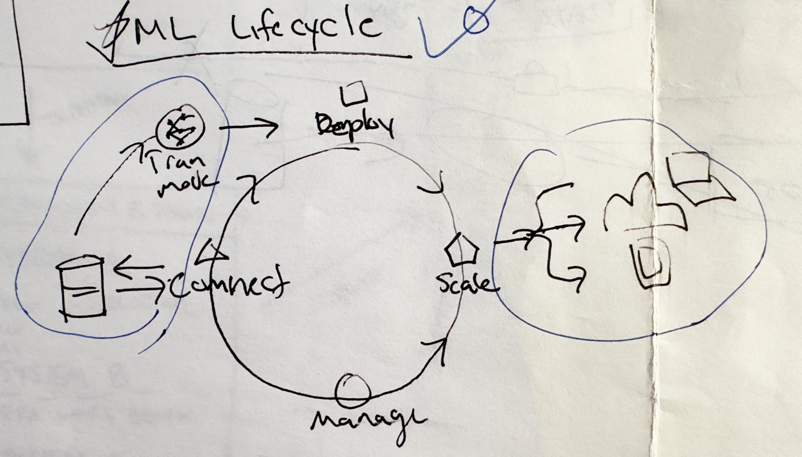
    I began by diving into the content provided by their marketing team, identifying the key ideas that would benefit from visual explanation. From there, I developed concepts for diagrams and illustrations that could simplify the messaging without losing accuracy.

    Sketch of the Machine Learning Lifecycle, and finalized graphic prepared for publication.

    Throughout the process, I worked within Algorithmia’s brand guidelines, collaborating with their marketing manager to make sure every design aligned with their color palette, typography, and overall tone.

    Algorithmia’s brand color palette (above) and the type palette. Headings, captions, initials, table text, and chart/graphic labels are set in Nunito Sans; body text is set in Georgia.

    Solution

    The final deliverables were a cohesive series of technical whitepapers supported by custom graphics that highlighted the core concepts. Each visual was designed to reinforce the text and guide readers through technical material more smoothly.

    The project gave Algorithmia a set of high-quality, brand-consistent whitepapers that not only looked polished but also made their content more approachable for their highly technical target audience.

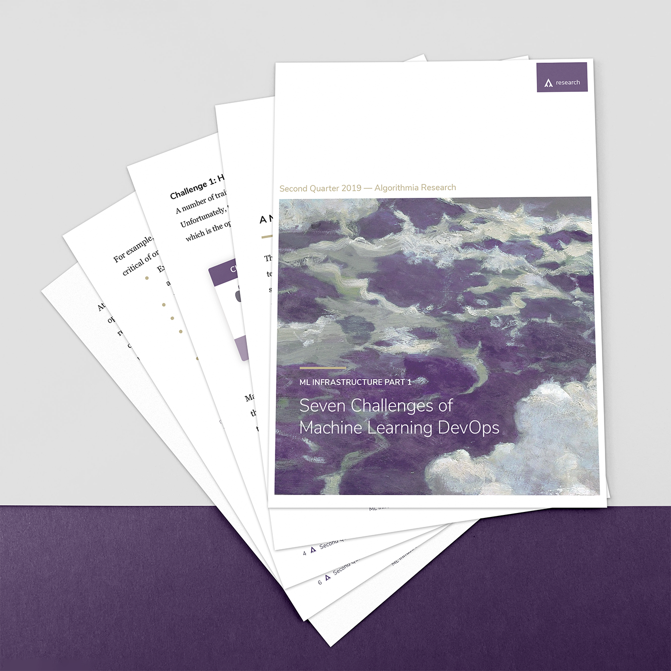
    Click the thumbnails below to view at larger size.

  • Holly’s Favorite Recipes

    Holly’s Favorite Recipes

    After a catastrophic fire at their historic schoolhouse and community center, the community of Holly, Washington was reeling. Local resident Paige Stockley approached me about producing a complete compendium of Holly recipes, drawing from the three historic community cookbooks from 1973, 1977, and 1990, plus new recipes from today’s Holly residents.

    The project grew from a simple reproduction to a passionate compilation of the community’s personal histories, photos, and family recipes. Proceeds from the sale of the cookbooks goes to support the rebuild fund.

    Collecting the history

    I started by collecting items from the community club, including historic photos of the town’s original families (many of which were lost in the fire), personal histories, stories, recipes, and the three community cookbooks. The objective was to bring to life artifacts passed down for generations, and to preserve those that were lost.

    Preparation and Design

    I scanned each page of all three cookbooks using a high-resolution flatbed scanner to capture color images of each page. Some pages were different colors, and because they were going to be reproduced in black and white, I had to normalize their contrast in Photoshop to make them readable.

    I also masked each page in Photoshop to remove the black scanner background. This involved masking around the edges of the page, as well as the holes for the comb binding. We chose to leave blemishes from use, as we felt this added to the character of the cookbooks—it preserved the reality that these recipes were made by real people.

    The final product

    The final product is a hefty book of nearly 300 pages with a soft-touch cover, over 50 years of family recipes, and over 100 years of photos and history.

    Community Debut

    Nearly 100 books were sold to the community and their family members in the weeks after the design was finished. Paige hosted a book launch party attended by many Hollyites. Guests were invited to make a recipe from the book and bring it to share.

    Details

    • Softcover with perfect-bound pages
    • Digital color printing on cover, black and white printing interior
    • W 8in x H 10in
  • Beyond The Pail—A Pictorial Memoir

    Beyond The Pail—A Pictorial Memoir

    I was introduced to Jere Smith by the chair of the design department during my final year at Cornish College. Jere is an illustrator, painter, and all around lovely man filled with stories to share. A true wordsmith, Jere had collected a lifetime of stories into a typed manuscript which had already undergone a multitude of revisions.

    Jere’s intent was to present each story along with paintings, illustrations, photos, and ephemera inspired by or related to the story. The process we embarked on was a learning curve for both the author and designer. The manuscript was in active review and underwent major changes throughout the design and layout process. The author had also amassed a vast library of images found on many generations of storage technology. Imagery included photos and documentation of his paintings and illustrations from which he wanted to select particular images to insert at relevant points in the text. I also scanned numerous pieces of ephemera—postcards, advertisements, patches, and more.

    The result was a full-color book which tells Jere’s story, from childhood to today, with humor and honesty. Paired with his lively imagery, the book truly embodies Jere’s friendly, unique personality.

    Details

    • Hardcover with perfect-bound pages
    • Digital color printing
    • W 8.5in x H 11in
    • Kindle print-replica eBook, 250 pages
    • Jere Smith, 2017
    • For sale at jeresmith.com
  • Annual Reports

    Annual Reports

    Since 2017, I’ve been engaged to produce the annual reports for Somos Amigos Medical Missions, an organization dedicated to providing excellent medical and dental care to remote communities in the mountains of the Dominican Republic.

    The need was straightforward: produce a mailed annual report that would be visually appealing and grab a reader’s attention. This was in addition to controlling production and mailing costs, so form was an essential consideration. Rather than a more expensive booklet-based report with bound pages, I chose to retain the organization’s tried and true approach of using a single sheet with a double gate fold.

    I was given the latitude to produce illustrative cover designs. The document is folded and tab sealed, with the back cover accommodating a variable data mailing address. The cover stands out among other mail pieces, grabbing the recipient’s attention. The straightforward construction ensures a lower printing and mailing cost as well as ease of address imprinting at the production facility.

    The design of the interior also necessitated creating numerous graphics, icons, and graphs to illustrate the statistics within the report, as well as to create a connection to the community of El Naranjito, which means little orange in Spanish.

    Aggregated demographic data was provided by the medical and dental clinics, divided into multiple categories: gender, age, and nationality.

    The response from recipients was positive and encouraging! Many recipients responded to the organization’s executive director with feedback that the cover imagery was engaging and gave the recipient a feeling of connection to the community in the D.R. One recipient even requested a specially-sized print of the 2020 edition’s cover, which depicts the community of El Naranjito where the clinic is located.

  • Farm Guide Cover

    Farm Guide Cover

    In collaboration with Dandy Co., I created an illustrated cover for the 2019 Tilth Farm Guide, a directory of the region’s farmers market and farm-to-table resources.

    We wanted an illustration that was visually appealing, eye catching, and showed the connection between the Puget Sound region’s rural farmland to even the most urban neighborhoods—all connected through the food grown here.

    I started by breaking the page into each of the major ‘biomes’ found in the region: mountains, rural farmland, suburban, and densely urban environments. Then I created simple, iconic buildings and objects that would be found throughout.

  • Selective Sovereignty

    Selective Sovereignty

    Most people in the United States are familiar on some level with the existence of Native American and American Indian tribal entities, and to some extent the history of Native American/United States relations over the past several hundred years.

    However, there are a great many people who are unaware of the process by which over 560 tribal entities have gained federal acknowledgement of their sovereignty. Indeed, many people in the U.S. don’t know that Native American tribes with recognition are considered to have a country-to-country relationship with the United States government… that those tribes are sovereign nations in and of themselves.

    Furthermore, there are many people who don’t know that next to these federally acknowledged sovereign tribal entities, there are even more non-acknowledged tribal entities who do not have the visibility or benefits conferred by federal acknowledgement. They are not entitled to funds from the U.S. government targeted at bolstering dedicated tribal education and healthcare services; they do not receive the benefit of land reserved for that tribe. The federal government does not consider them sovereign entities.

    This project was the perfect combination of my interest in mapmaking, data visualization, and the social issue facing hundreds of tribes across the U.S. By delving into research surrounding the process and history of federal recognition, as well as the numbers and locations of many non-acknowledged groups, I was able to create a high-level view of the Pacific Coast and the locations of 114 different tribal groups which are currently not acknowledged by the Federal Government. Some of these groups—including the Dxw’Dəw?Abš (Duwamish) Tribe which is local to me here in Seattle—have received recognition, which was then rescinded. These tribes and many others continue to fight lengthy legal battles in order to gain that recognition.

    The map was created in Adobe InDesign using shorelines from data provided by OpenStreetMap, with additional elements from the USGS HydroSHEDS project. Listing of non-acknowledged tribes was based on research by Troy Johnson, Cal State, Long Beach, with geographic locations estimated by searching for registered addresses of each entity.

    Details

    Selective Sovereignty—American Tribal Entities of the Pacific Coast without Federal Recognition

    • W 18in x H 24in
    • Built using QGIS, Adobe Illustrator, and Adobe InDesign.
    • Original version, 2017; last updated 2023.
  • La Cubanidad

    La Cubanidad

    On the innovators who created Cuba’s national musical identity.

    One facet of design that has always interested me is the artwork that graces the covers of music discs and records. There are great many ways to grab someone’s attention, to get them to pick up that album and listen.

    In this research project, I explored the community of graphic artists and musicians who had their hands in la cubanidad, or the distinct Cuban-ness of the Salsa genre of Latin-American music. Artists like Izzy Sanabria and Walter Velez produced countless albums and posters, many of which found their way to the New York music scene in the 1960’s and 70’s and influenced a whole new generation of designers.

    This research project was published in the first edition of the text Parallel Narratives, a compendium of bibliographies produced by design students at Cornish College of the Arts, and edited by Natalia Ilyin and Elizabeth Patterson.

    La Cubanidad it appears published in Parallel Narratives.

  • Facsimile—After Fortunato Depero

    Facsimile—After Fortunato Depero

    This book art project involved creative elements that were novel to me. First, the use of posts in the stab binding as homage to The Bolted Book, a reproduction of Fortunato Depero’s 1927 book Depero Futurista. I had never before used posts like this and the effect is a completely sturdy binding.

    Second is the use of cyanotype blueprint paper as the printing medium. I composed a graphic to print at 24″ x 36″, which was imposed onto the light-sensitive blueprint paper. This paper was in turn fed through a developer which exposed the paper to UVA light and gaseous ammonium. What is left after this reaction is a blue hue developed on the page.

    Details

    “Inspired by Depero Futurista, The Bolted Book, we present a collection of blueprints exploring the intersection of mechanical and natural processes.”

    • Hardcover stab binding, 42 pages, French fold
    • Cyanotype printing, screen printed end pages
    • W 23.6mm x H 10.4mm x D 21mm
    • Edition 6 of 10
    • Multiple Contributors, 2017